Designers React to the Just Eat re-brand
Design experts share their opinions of the new Just Eat rebrand.
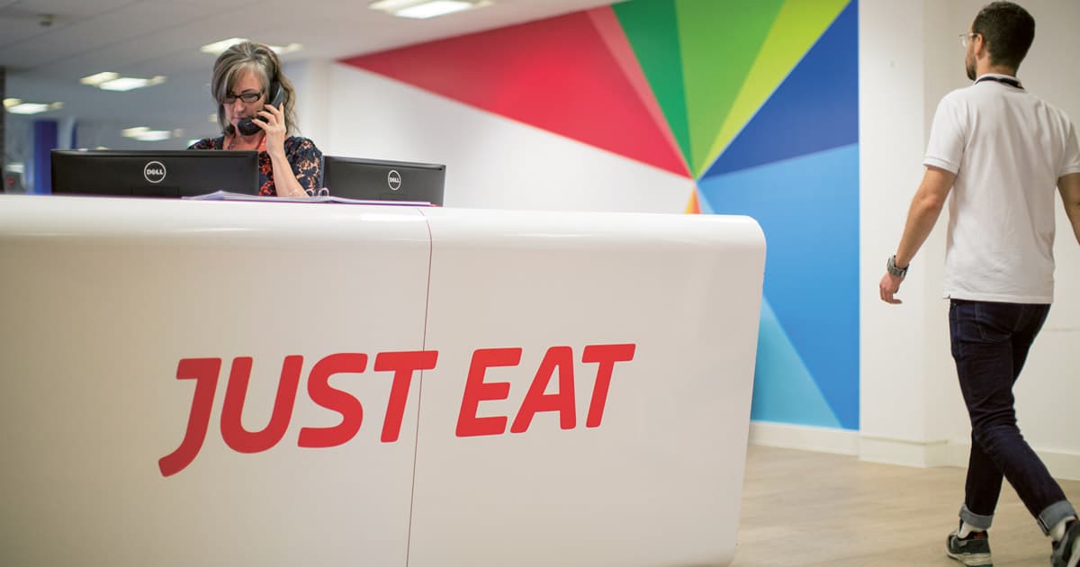
Hot on the heels of DesignStudio’s rebrand of rival Deliveroo, the Just Eat rebrand by Venture Three adds a splash of colour to the online delivery service. We discuss whether the new logo design and identity tickles the tastebuds.
Shifting perceptions
“The new brand signals Just Eat’s focus on shifting perceptions of the global food delivery industry; changing behaviours around how and when we get the food we love each day,” says Graham Jones, the partner and creative director for the Just Eat rebrand at Venture Three.
“Based on our creative idea of ‘find your flavour’, we developed an expressive new identity, complete with a burst of colour and animation style that adds flexibility and opportunities to delight in the brand experience. All of our work is based on humanising what is essentially a technology platform, now with a vision of ‘creating the world’s greatest food community’.”
Steve Jones MD at Velocity Design said “I really like it… it’s bold and engaging… I love what they’re also doing inside the business, wall graphics etc. creating an overall vibrancy. Much like the ethos we have with our clients. We try to engage, re-invigorate and be bolder. But after all, it’s all about ‘clicks’ – drive the clicks up and you drive sales up.”
Clean and flexible
“This is a fantastic rebrand that has much more flexibility and vibrance than the previous design,” explains Christopher Colouryum, a freelance graphic designer and illustrator. “The cursor in the logo has been dropped, which – although a nice concept – was previously poorly executed. It’s eye opening to realise that the cursor is a rather dated object now, and as Just Eat’s users predominantly use mobile devices, its relevance has passed.
“The typeface now looks much cleaner, and the use of italics makes it feel like this is a brand that moves. The palette has shifted to a full spectrum of colour, which looks great in application and represents the brand’s diversity of cuisine.”
Mass appeal
“The Just Eat rebrand is designed to appeal to the masses,” says Rohan Nanavati, founder and art director at Roar Studios. “Bright colours, tacky design and below-average typography combine to refrain the consumer from thinking anything else about the brand apart from to just eat!”
“This is one of the most mediocre rebrands we’ve seen this year, one that clearly believes distribution and network trumps a well designed identity. While this holds true for many brands, it makes success dependent solely on the service. What would have been better is a brand that feels responsible about the quality of food it delivers – rather than a brand that will deliver just anything.”
Original article credit: creativebloq.com